 LIMITED | IRELAND
A rebrand usually starts with a logo and ends up
touching every surface a company owns. The ones
that go smoothly are the ones where a system
existed before the refresh, rather than a PDF
style guide that nobody opens and a folder of
files that drift apart within a quarter.
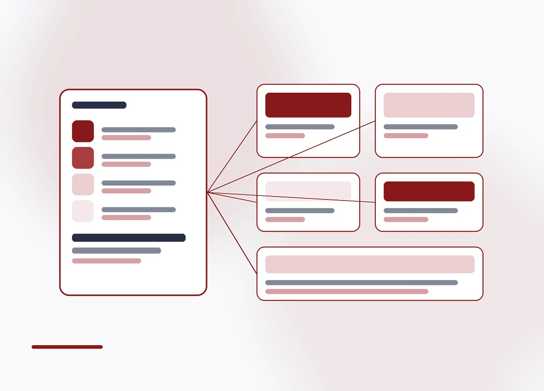
We build identity systems on reusable design
tokens. Colour, type and spacing are defined once
and referenced everywhere, so a change
propagates instead of starting a redraw.
A rebrand should change the
surface, not the plumbing. If it
breaks everything underneath,
it was never really a system.
That matters most when the brand lives in
software. A website, an app and a customer
portal should not each hold their own slightly
different idea of what your red is.
Guidelines are written for the whole team rather
than the design department, with templates for
decks, social and email, because that is where
consistency actually breaks.
GET STARTED
Ready when you are.
Tell us where the brand is drifting and
we’ll scope it on a call — no obligation.
Service Mapping
-
Identity and
logo systems -
Design tokens for
colour and type -
Component libraries
for web and app -
Brand guidelines
people will use -
Templates for decks
and documents -
Social and email
templates -
Product UI
consistency -
Accessibility and
contrast checks -
Asset library and
handover -
Rollout across
your channels
BENEFITS
Why ChooseOur Solution
Built as a system, so a
change propagates instead
of starting a redraw.
-
An audit first
We catalogue every surface the
brand already lives on before
proposing a change, because that
list is always longer. -
Built for software
firstMost brand work is designed for
print and then forced into an
interface. We start from the
screen, because that is where
your customers actually meet
the brand. -
A rollout that lands
A sequence for changing the
surfaces customers actually see
first, so the rebrand is live
where it counts instead of stuck
behind the long tail. -
Contrast checked,
not guessedEvery colour pairing is tested
against accessibility contrast
ratios, so the palette does not
quietly make your product
unusable for some customers. -
Templates that help
Decks, documents, social and
email. Consistency rarely fails
on the homepage, it fails on the
sixth slide of a proposal
somebody built in a hurry. -
Handed over, not
held hostageSource files, tokens, fonts and
the component library are yours
at the end. Another agency can
pick it up without starting
again, which is the test of
whether it was a system at all.
WHAT’S INCLUDED
-
Identity system built on tokens
-
Live components your developers
can import, not screenshots -
Guidelines written for the
whole team, not designers -
Editable templates in the tools
your team already opens -
Full handover of source files,
tokens and assets
OUR PROCESS
How wework
From a drifting brand to a system your whole team uses.
-
01
Audit
We find every surface the brand lives on and where it drifts.
-
02
Define
Tokens, type scale and the rules that hold it together.
-
03
Build
Component library and templates for the places it is used.
-
04
Document
Guidelines written for the people who actually apply them.
-
05
Roll out
Applied across your channels, with the source files handed over.